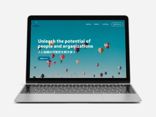
Project Overview
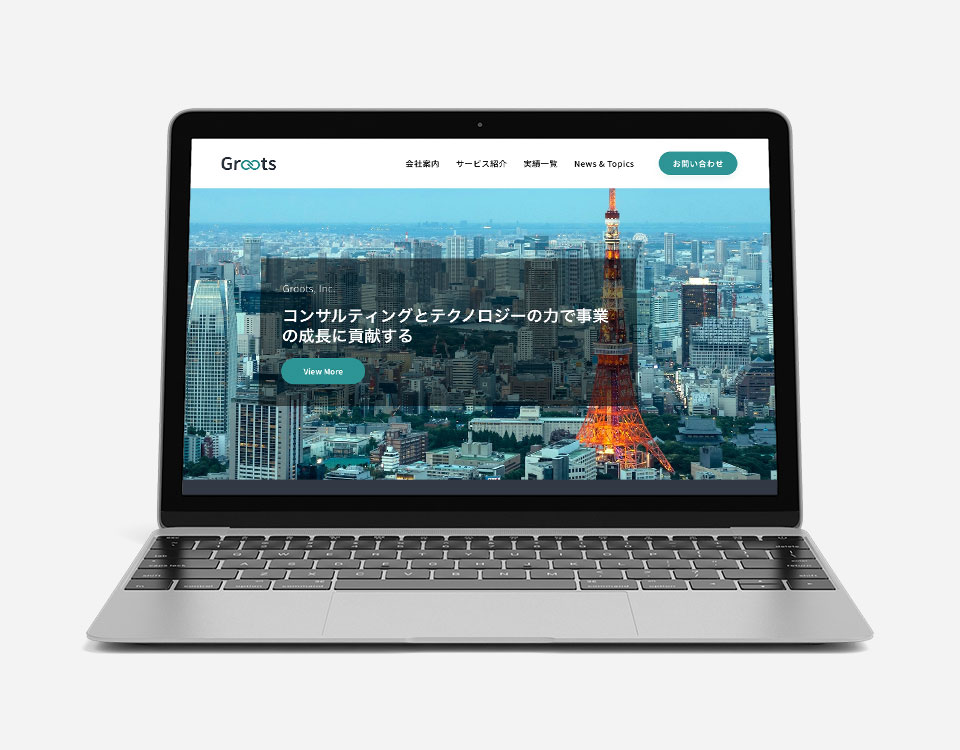
Groots, Inc. helps companies to launch new business projects, implement information technology for business, software development, branding, as well as support for its operation.
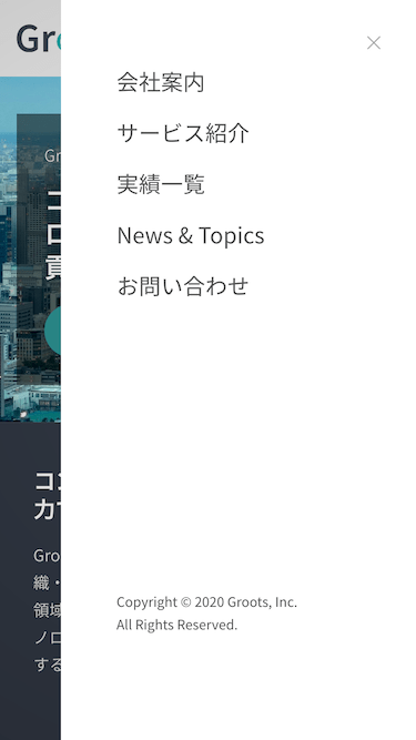
Mobile Friendly
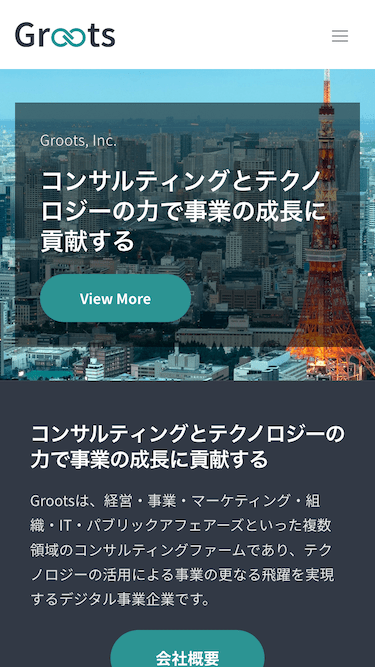
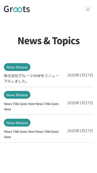
Google prioritizes mobile-friendly websites over those that are not in mobile search results. The Google algorithm change that occurred in 2015 tweaked the way Google displays mobile search results. Websites that are optimized for mobile rank better than those that don’t.
THE CHALLENGE
UX design in Japan is quite challenging and generally different from other countries. Japanese websites tend to use long copies and write very detail information. The main reason is that it changes the value of the product or service. This act of providing guidance is appreciated by Japanese customers.
Therefore, the UX design process for websites in Japan requires an extra effort to reduce the stress rate of the users. The amount of scroll needs to be reduced especially on mobile devices. More text needs to be fit in one screen.
THE RESEARCH
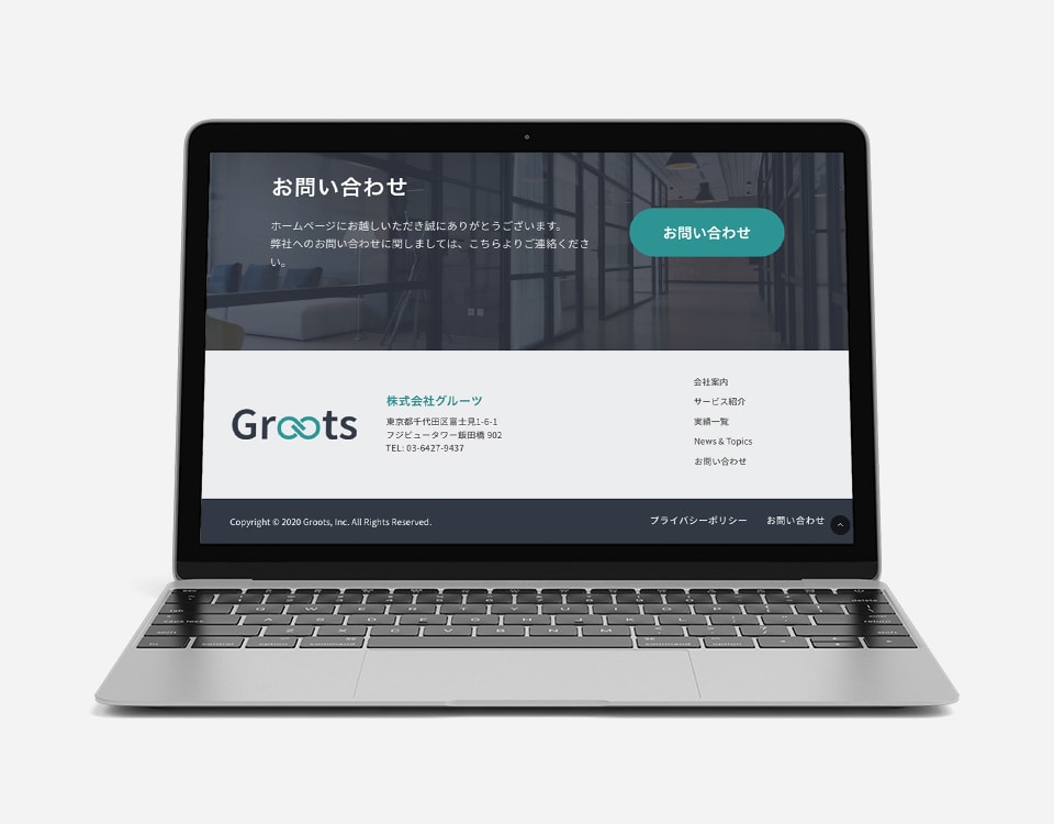
The process began with defining the user profile of potential visitors. Groots’ main customers are well-established big corporations in Japan. The decision-makers are between 35-55 years old. For better user experience, extra steps need to be taken on creating the design. More obvious action buttons need to be placed instead of just clickable icons that lead to different pages.
Client Info
Groots, Inc. – A Tokyo-based Consulting Company. Groots, Inc. helps companies to launch new business projects, implement information technology for business, software development, branding, as well as support for its operation.


